Mosaic Brand
Guidelines Uplift
Three years after Mosaic's brand guidelines launched, inconsistent implementation had become the norm. Without a scalable logo system, clear color guidance, or large-format specs, teams across the company were improvising — and it showed. I was tasked with diagnosing the key pain points and rebuilding the parts of the system that weren't holding up in the real world.
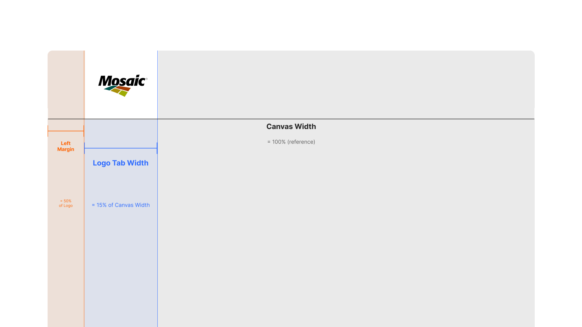
The original system — built by an outside vendor — was too rigid to scale. Logo sizing rules relied on static measures with no room for scaling across formats, color guidance was absent despite a broad palette, and large-format applications like billboards, backdrops, and pull-up banners were never addressed — formats Mosaic produces constantly. The result was a brand that looked different depending on who applied it.
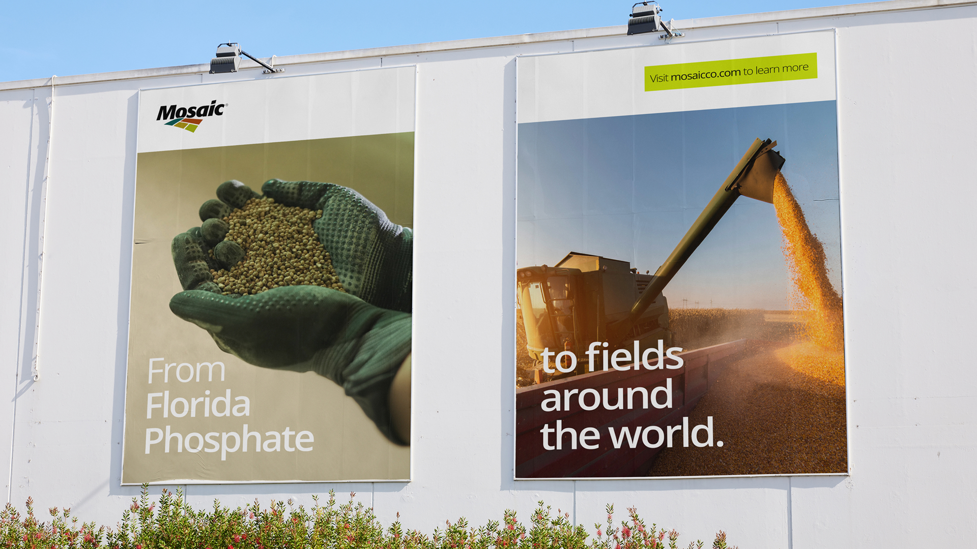
I rebuilt the logo system around percentage-based sizing tied to canvas width — replacing static examples with a rule that scales cohesively across any format. Color usage got visual balance guidance for the first time. Large-format applications — billboards, backdrops, pull-up banners — were specced out with real-world mockups. Every decision was grounded in who Mosaic actually is: the world's leading phosphate and potash producer. A serious, bold brand.

With the system rebuilt, the guidelines needed to show up in the real world — not just on paper. A selection of branded materials showing the system applied across formats and channels.
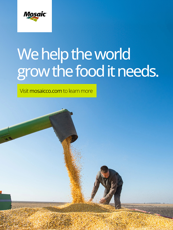
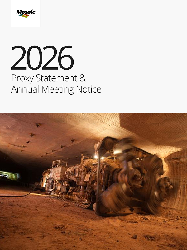
I coordinated Spanish translations for South America, built the internal communications plan, and updated every template company-wide. The refreshed guidelines are now adopted across all 13,000 employees — giving teams a clearer, more confident grasp of the brand and how to apply it consistently across every channel.